We’ve heard a lot about college affordability, and the topic frequently generates discussion about tuition cuts or tuition resets. This discussion is often focused exclusively on private colleges, not without good reason: Using 2023 data (the most recent available in IPEDS) we can see what sticker price actually means for new students (hint: not much.) It’s unlikely to have improved in the just completed 2025 cycle.
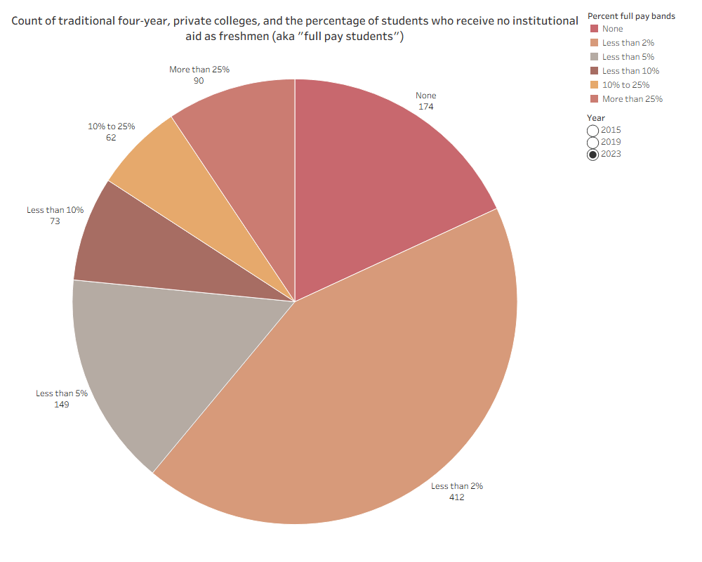
I removed several hundred four-year colleges from this analysis: Seminaries, Yeshivas, very small colleges, and other institutions with very narrow or specific missions, leaving 960 traditional four-year colleges in the analysis. Of them, 174 enrolled zero students without institutional grant aid (that is, zero “full pay” students); 412 enrolled less than one in 50 full-pay students; and another 149 enrolled less than one in twenty. So in other words, based on either merit or need-based institutional aid alone, almost no one pays the full sticker price.
It’s easy to point at private colleges with tuition and fee levels over $40,000 and realize that something has to change.
But that overlooks something bigger and more important, I think: The nation’s four-year public institutions, which award about two-thirds of all the bachelor’s degrees in the US annually. In looking at tuition levels at those institutions, I think we’re seeing one of the most common strategies in higher education: We do it that way because we’ve always done it that way.
Historically, public institutions had missions focused almost exclusively on the population in their own state. Enrollment at the University of <insert state> was overwhelmingly made up of students from <insert state>, with few exceptions. States funded the higher education enterprise, and there was no need to look beyond the borders of <insert state> for enrollment. Tuition for residents was very low. On those rare occasions when students would cross state borders to attend a public institution elsewhere, nonresident tuition was considerably higher, almost as a disincentive to enroll.
While each state’s funding model is different, the persistence of much higher nonresident (sticker) tuition continues to be common. But let’s think about that from a marketing standpoint: Your home market knows about you and hears about you frequently. Students from your state who want to live and work in your state understand the equity of a degree from an in-state institution, and the post-graduate connections it can create. And the vast majority of students go to college within 500 miles of home.
So, faced with market opportunities beyond your border, with a market that knows less about you, has less natural affinity for you, less propensity to travel farther, and that would be somewhat handicapped returning to their home state to work, you decide….to charge a lot more? Maybe this makes sense, if you’re Michigan or Berkeley or Virginia, all places with powerful reputations, and more than enough applicants to fill your class, or Florida, which in a bit of a throwback, actually wants to enroll very few nonresidents.
Below is a scatter of 2024 Tuition and Fees at Public Flagships and the (1862) Land Grants. I kept the group small for clarity, and to look at institutions that are nominally similar in mission.
The x-axis shows the premium a nonresident undergraduate pays (based on sticker) for tuition and fees compared to a resident students. The y-axis shows the premium ratio, that is, a value of 3 means those fees are three times greater for a nonresident than a resident.
For instance, at UVa, the nonresident premium is about $38,000, while at UNC, the Premium Ratio is about 4.5.
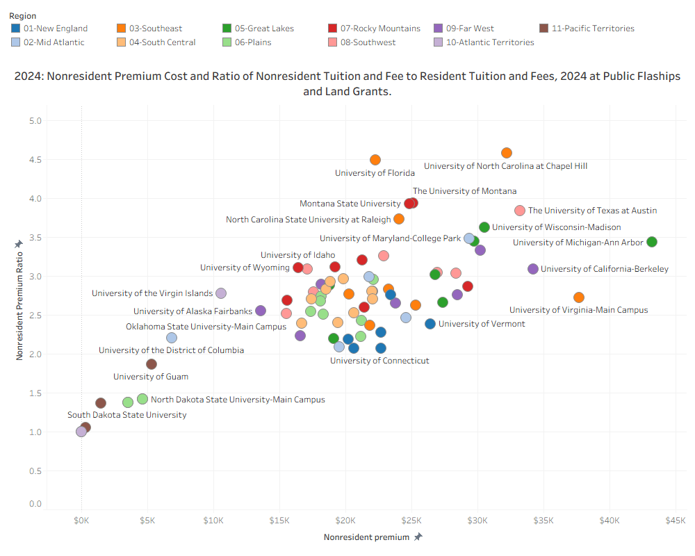
It is very difficult if not impossible to use IPEDS data to figure out how much aid is used to discount these numbers. Counselors tell me that many of the institutions on the right side of the chart offer very little institutional aid to student, while many others in the middle or to the left offer lots of it. Again, state funding models, capacity issues, and demand curves all come into play. There is no approach that would work for all institutions, but it would be prudent to examine how much students pay, and to ask about the power of a more realistic, reasonable, and affordable tuition level in today’s market.
And imagine this chart if you could click a button and see what percentage of the first-year classes come from out-of-state at these institutions, or what the trend has been over the last decade, or how these institutions compare on net price for low-income state residents.
You may come away perfectly happy with your current approach, and that would be great; the unexamined life is not worth living, as the man said. But a deeper dive into this topic might uncover new approaches and new opportunities for you to address enrollment, revenue, or capacity issues, all things we’re reading about almost daily.
Discover more from Enrollment VP
Subscribe to get the latest posts sent to your email.
